登录项目表格
在应用程序配置页面上,使用登录项表来定义哪些元素会显示在登录页面上。 添加、删除或重新排序项目以自定义表单。
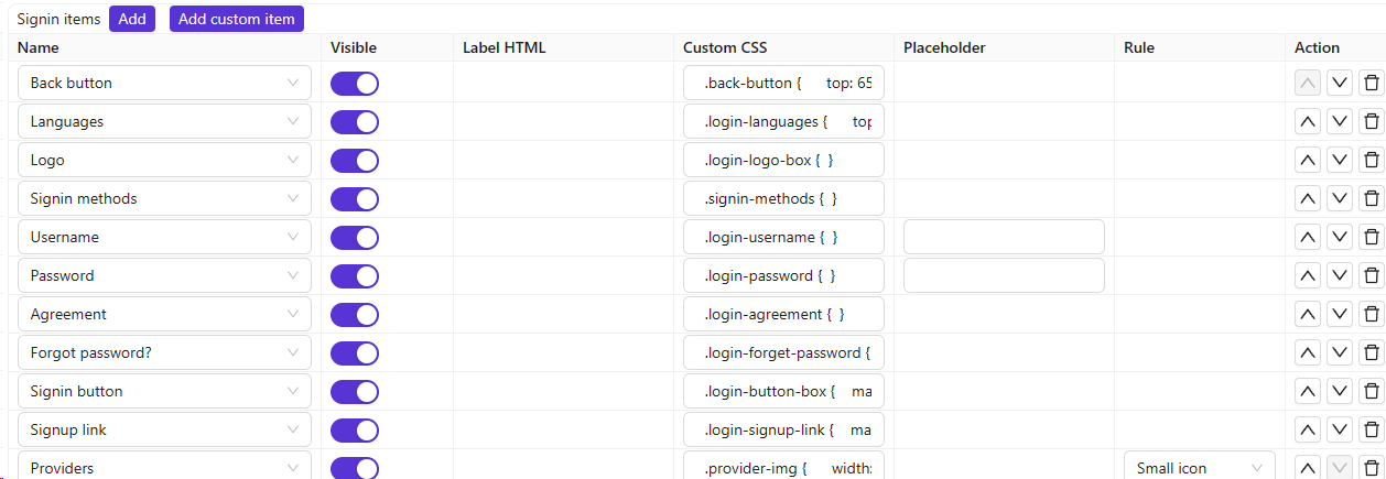
列引用
| 列 | 值 | 描述 |
|---|---|---|
| 名称 | — | 登录项的名称。 |
| Visible | True / False | 在登录页面上显示或隐藏。 |
| Label HTML | — | 对于自定义项,使用HTML作为字段标签。 |
| Custom CSS | — | 此登录项目的 CSS。 |
| Placeholder | — | 该字段的占位符文本。 |
| Rule | 规则项目 | 自定义此项目的规则(见下文)。 |
| Action | — | 向上移动、向下移动或删除。 |
Forgot 密码 visibility
将**忘记密码?**项目设置为“可见:False”可在UI和API级别同时禁用此功能。 当该功能处于隐藏状态时,后端的 /api/send-verification-code 端点会以错误方式拒绝密码重置请求,从而防止客户端通过直接调用 API 来绕过 UI 限制。
Language selector 规则
“语言”项支持一条规则,用于更改登录和注册页面上语言选择器的呈现方式:
| 规则 | 描述 |
|---|---|
| (empty) | 地球图标下拉菜单(默认行为)。 |
| Label | 一个带标签的Select组件显示,而非图标下拉菜单。 |
Captcha 规则
Captcha项支持控制验证显示方式的规则:
| 规则 | 描述 |
|---|---|
| Normal | 发送验证码时,验证码会以模态框形式显示。 |
| Inline | 验证码直接显示在登录页面上。 |